About Data Studio
Data Studio is a free data visualisation tool from Google. It allows data to be pulled from various data sources such as Google Sheets, CSV files, SQL databases etc. or via pre-built API connectors from tools such as Google Analytics and BigQuery. Data Studio’s main advantage is the ability to quickly and iteratively visualise data in scorecards, tables and numerous styles of charts to create dashboards.
Product overview: https://support.google.com/datastudio/answer/6283323?hl=en
Access
https://datastudio.google.com/ (Data Studio dot Google dot com)
If your Google account has been given shared access to existing reports, then they will appear in the main interface or if you click ‘Shared with me’ in the left-hand menu (desktop experience).
Additionally, Google provides several templates (including an introduction/onboarding guide) that you can click into and explore, which are already hooked up to data sources so that charts and other items are not blank. You can easily copy these reports and add your own data sources – it’s a good way to get familiarised with the product and start to get hands on with your data.
UI overview
When you first open up a Data Studio dashboard you’ll be presented with a header like above. Breaking elements of this down:
Top left: Report name & pagination (if multiple pages exist)

Top right (in order: left to right)
- Download PDF (all pages or individual pages)
- Schedule email reports
- Link to report
- Go full screen
- Refresh the data (pull new data from data sources)
- Make a copy of the report
- Add people to the report (view, edit access etc)
- Help
- Edit the report (if you’re logged into an account with sufficient permissions)
- Links to other Google products
- Change Google accounts or log out
Clicking ‘Edit’ causes the page to refresh and new sub-menus to appear.

Text menu:
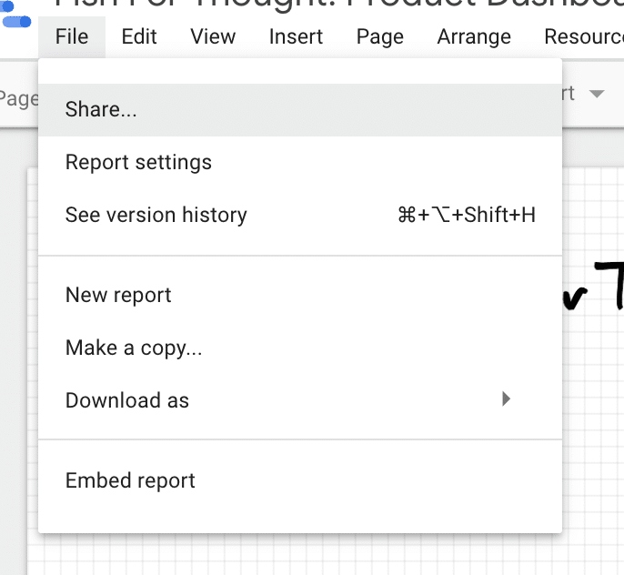
Under ‘File’ you have the option to ‘Share…’ the report.
‘Report Settings’ enables editors to set a default data source, date range dimension, Google Analytics ID and whether caching is enabled.
‘See version history’ allows you to view previous versions and rollback if needed.
‘New report’ creates a completely new blank report.
‘Make a copy…’ makes a duplicate copy of the report, creating a new file.
‘Download as’ enables editors to download the report as a PDF.
‘Enable embed’ provides <iframe> and a URL to directly embed the page into a HTML page etc.
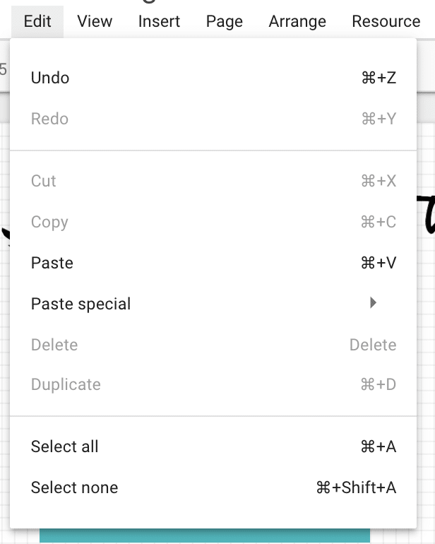
‘Edit’ link provides a number of shortcuts.
‘View’ allows a grid to be added to the report and re-sized, to improve the design and layout.

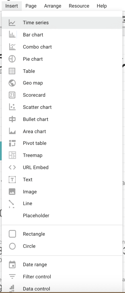
‘Insert’ allows editors to add different asset types to the report, such as charts, tables, maps, text, images, shapes, filters, date ranges etc.
‘Page’ enables editors to create/copy/delete/skip pages.
‘Arrange’ allows alignment of elements and also bulk repetition operations, such as grouping elements, or copying a set of filters to every page.
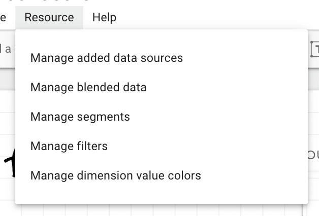
‘Resource’ is a very handy menu that provides quick access to data sources and other options such as segments and filters at report-level (rather than page-level or chart-level).
‘Help’ provides links to documentation, the Data Studio community forum, bug reporting / feature requests and video tutorials.
Sub-sub menu
Under the text-based menu described above (file, edit etc), there’s an icon-based menu illustrated above. This largely provides short-cuts to items already mentioned and available via the text-based menu.
These icons are:
- Pagination
- Select arrow to select specific elements. CTRL + click and drag to highlight also has the same effect. CTRL + A is ‘select all’. CTRL + C is ‘copy’. CTRL + V is ‘paste’.
- Undo / redo
- Add a chart
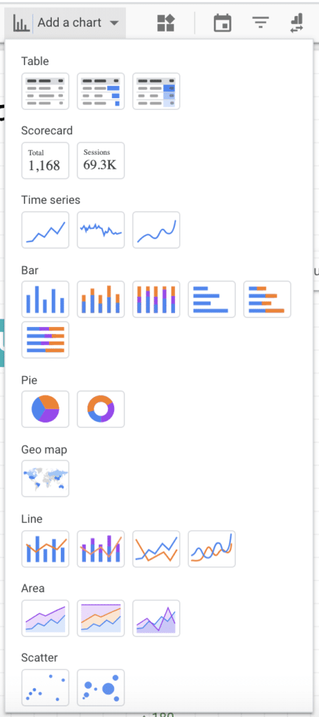
5) Community visualisations (not very useful at the moment imo)
6) Add a date range
7) Add a filter (filter data by any dimension or metric)
8) Data control (keep the same charts, swap the underlying data source)
9) Embed external content (e.g. another dashboard)
10) Add a text box
11) Add an image
12, 13, 14) Add lines and shapes
15) Layout and theme
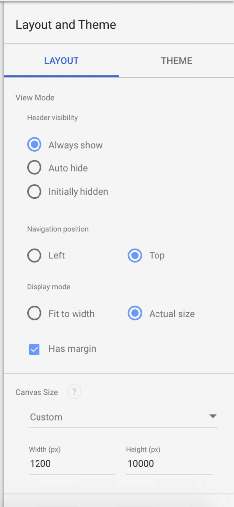
Right-hand side menu
When you open up a new report or click on the background of a page, a ‘Layout and Theme’ menu will appear on the right-hand side. This allows control over a number of design items such as whether the report is full screen and responsive, or a standard fixed size. (I’ve always used a standard fixed size, as the responsiveness has not properly worked so far)
Adding Data Sources
Once you’re ready to go there are two avenues to connect a data source to your report.
- ‘Resource’ –> ‘Manage added data sources’ –> ‘Add a data source’
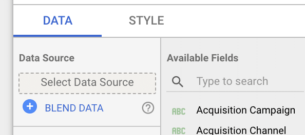
- Insert a chart, a menu will appear on the right-hand side. Click ‘Select Data Source’, Click ‘Create New Data Source’ at the bottom
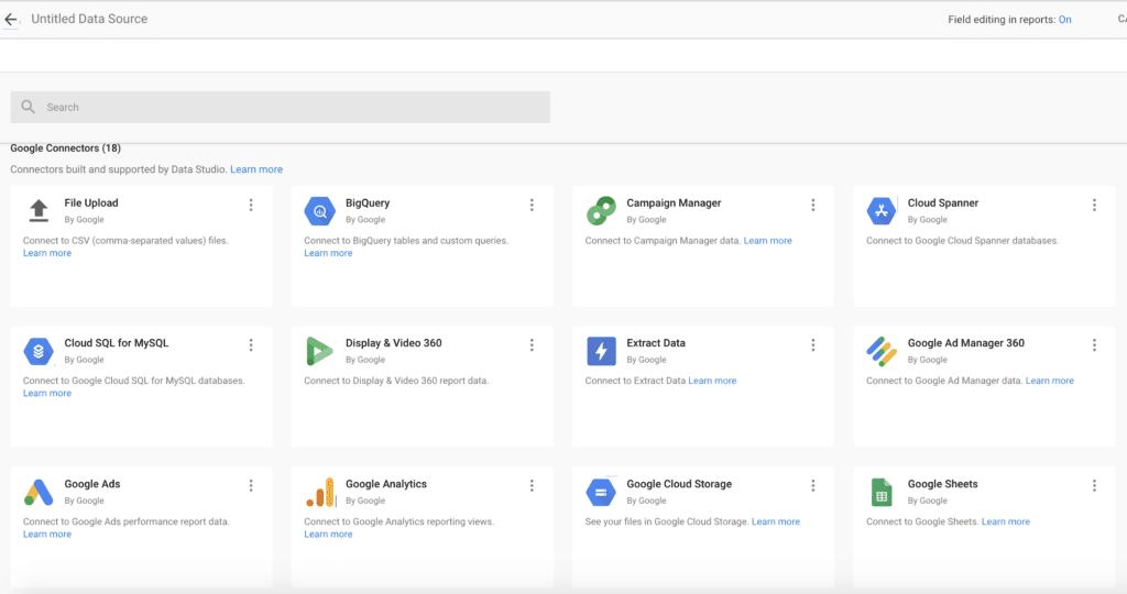
This screen will then pop up with Google Connectors and Partner Connectors:
Once you’ve selected a connector and authenticated (if needed), Data Studio will pull in and display data points as dimensions (green) and metrics (blue).
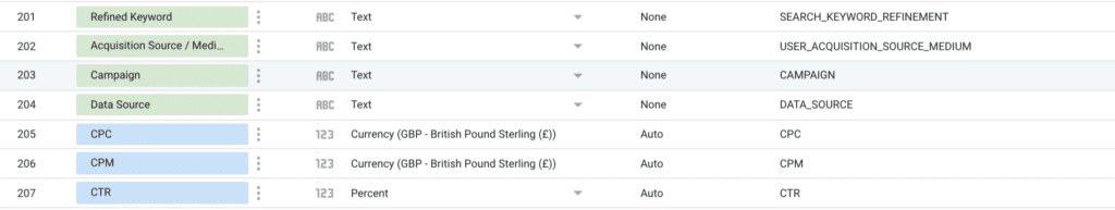
You can change metrics to dimensions and vice versa. You can also duplicate metrics, rename them and change their format (e.g. changing a number to a percentage, or changing a number to text).
Click ‘Done’ to complete adding the data source.
Adding Custom Metrics
If you edit a data source you can add new metrics, in the form of calculated metrics. This is really useful for transforming or cleaning data into a format that is more usable.
Documentation: https://support.google.com/datastudio/answer/6299685?hl=en
Adding Elements such as Tables, Charts & Scorecards
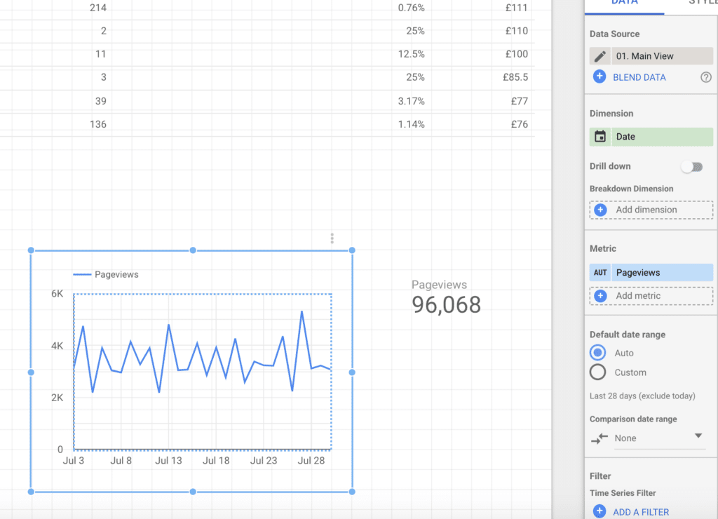
Tables allow you to add up to 20 dimensions and 20 metrics, which is very useful to get a base understanding of the data you’re working for (some charts only allow 1 dimension), so it’s worth drilling into the data in a table before going full out with different charts.
Drag and drop the element into the position you would like. It can be easily moved and resized after placement.
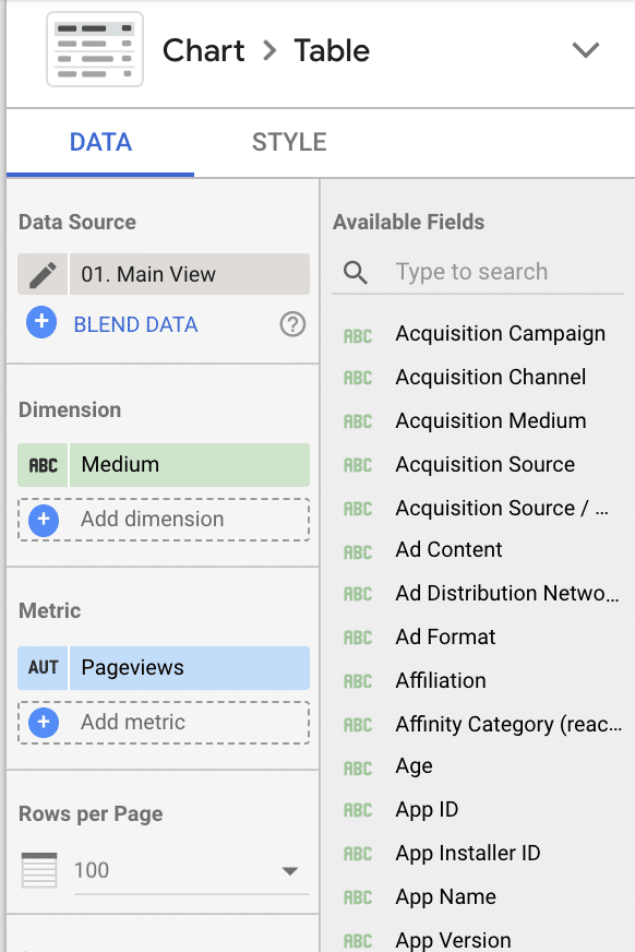
Once your table or element is placed, a right-hand menu will appear:
From this menu you can define dimensions and metrics for the table, which will auto-refresh when new dimensions and metrics are added, changed or removed.
In addition to tables, there are options to add ‘scorecards’, which are useful to highlight hero metrics or KPIs.
And ‘time series’, which needs a ‘date’ dimension for the x-axis. Time series are useful for understanding how things are trending.
Other options include ‘bar charts’, which offer the most simple visualisation and are useful for comparisons.
‘Pie charts’ are excellent for showing proportionality and share. If you can have percentage breakdowns, then pie charts normally provide a useful visual.
‘Combo’ charts combine bar charts and line charts.
‘Area’ charts are really useful to understand to proportions at specific timeframes (e.g. in July, X channel provided 60% traffic, in August that was 80%). Particular useful context and insight for understanding changes in performance.
‘Scatter’ charts are useful for seeing patterns and outliers, relative to other data points.
‘Pivot tables’ work similarly to Excel pivot tables and give excellent flexibility to drill down into precise perspectives.
‘Bullet charts’ are useful to understand and measure performance versus targets or benchmarks. Currently, the target line is manually updated, eventually it would be realistic to expect this to become automated (e.g. last year’s daily traffic level is the benchmark to surpass).
‘Treemaps’ are a new feature and enable visualise weighting and proportionality, similar to pie charts, though more abstract.
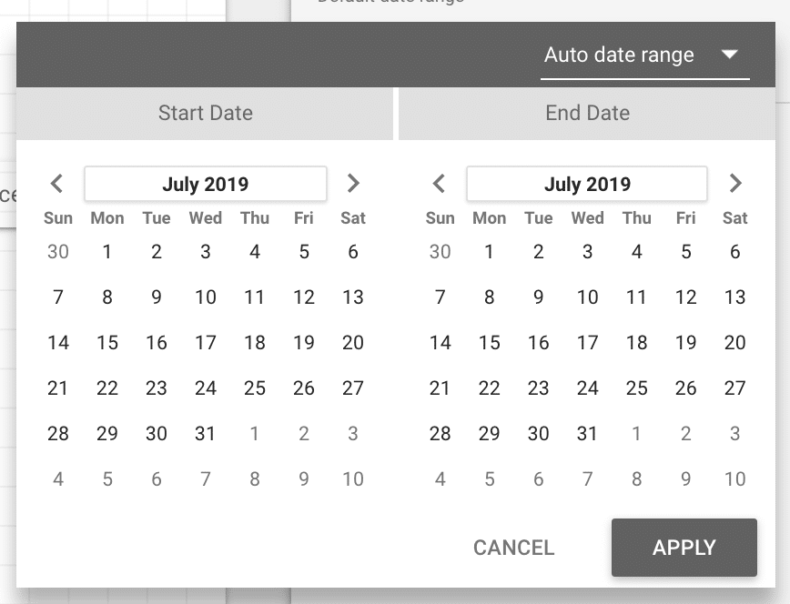
Adding A Date Range
Selecting a date range icon adds a date range select dropdown to the report:
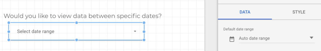
Clicking on ‘Auto date range’ allows editors to set a default date range across the whole report. By default this is set to the past 28 days. Note, the data range specified on each individual table or chart element will take precedence over the default. Selecting a date range will work across different date dimensions e.g selecting 1st January to 31st January would only show ‘January’ if the date dimension is ‘Month’, or week 1-4 is the date dimension is “Week of the year’.
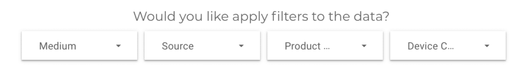
Adding Filters

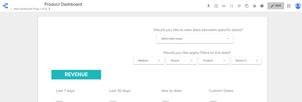
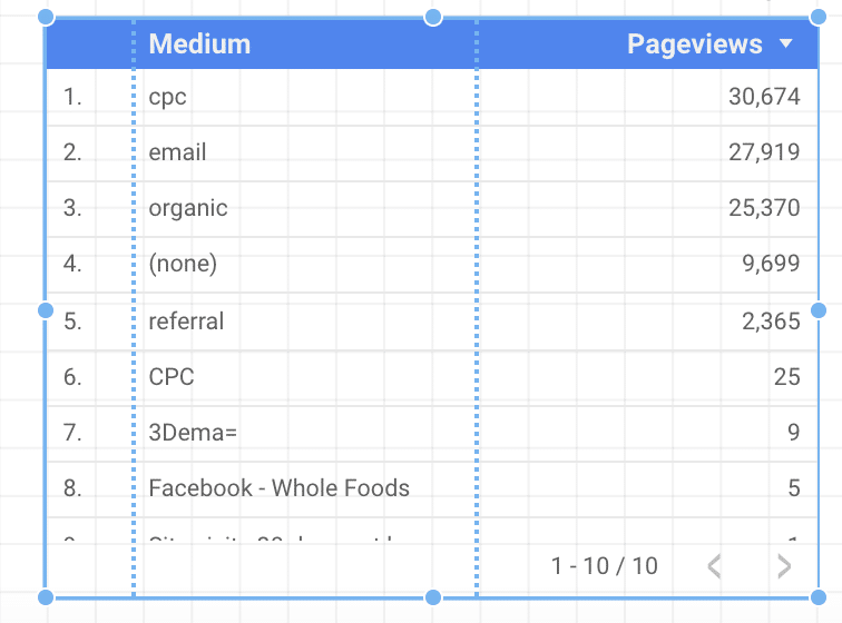
Clicking the filter icon allows end users to self-service and filter data based on their specific needs. For example, the following filters have been created in this example:
If the end user is only interested in knowing how ‘Organic Search’ is performing, then they are able to select the ‘Medium’ filter and choose ‘organic’.
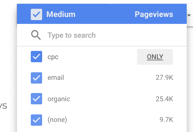
It’s possible to select ‘only’, multiple using the tickboxes, ‘all’ or ‘none’ using the tickbox in the top left (next to ‘Medium’ in this example). It’s also possible to deselect all, type in something (E.g. ‘search’), then tick select ‘all’ and it will select only channels including ‘search’ in the value.
The filter dimension (‘Medium’ in the example) and the metric on the right-side (‘Pageviews’ in the example) is fully customisable and orderable in the right-hand menu.
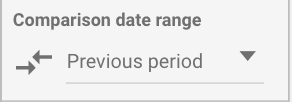
Adding Comparisons
A nice feature of Data Studio is to be able to quickly, visually compare one data set versus another. Most of the time this relates to comparing performance over time (E.g. how many visitors in the last 7 days compared to the 7 days previous to that? Or how are conversions performing month on month?)
Data Studio has built-in functionality to accommodate this view, with preset options provided such as ‘previous period’ (e.g. the time period selected in the date range); fixed (e.g specific dates that events happened); Year on Year; Advanced (trailing days/dates).
This displays like so:
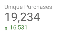
Green, by default being positive, Red, by default being negative. These colours and styling can be easily changed by selecting ‘Style’ in the right-hand menu after selecting an element.
Controlling how data displays in elements
In the right-hand side menu, there are several options such as ‘Rows per page’, which controls how many records show in a table. A summary row appears at the bottom of tables, to show total sums for columns (e.g. total revenue from all channels), or averages (e.g. average click-through rate from all channels)
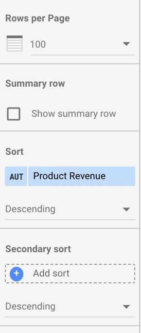
Depending on the perspective/narrative you’re trying to share, the ‘Sort’ column is useful. For instance, sort top selling products by ‘Product Revenue’, or sort Products by number of Transactions. End users have the ability to sort and interact with tables and charts, so this is very much about the first impression.
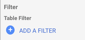
Using Filters
Filters allow you to remove data that you don’t want appearing in elements. For instance, you may want to remove any NULL instances or, for example, pages than have received less than 5 pageviews.
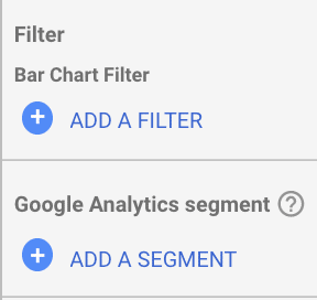
Using Google Analytics Segments
If there are segments available in Google Analytics, these can be pulled in Data Studio (e.g. people who have made purchases). This is particularly useful if clients have advanced segments that they use frequently or refer to. This can be found in the right-hand menus under filters.