A reflective question to start: if a carpenter stops to quantify the level of friction on the plane – what is the impact on the final product? What is the impact to the current and ongoing process? For the individual carpenter, their team and the wider business?
With Google now offering the ability to automatically link Google Analytics and Firebase (web + app) data, a new dawn of event-based tracking (and conversation) is here. Having used Firebase for the past few years, the granular event data offering out-of-the-box is phenomenally enriching, over and above basic conversation and perspectives glinted on the surface by Google Analytics UI reporting and dashboards.
A real-world example:
The chart below shows a series of on-boarding events for an iOS app collected by Firebase (creating useful product insight and a UX / performance funnel to improve – nice!).
At a top-level this perspective shows drop off between events and potential opportunities to improve. Conversion rates overall, per step, monetised event values can be created to dive further and start to assess commercial impact and resource allocation.
But here’s why events are useful – pivot by any data point you like to create a new perspective. For example, by device model:
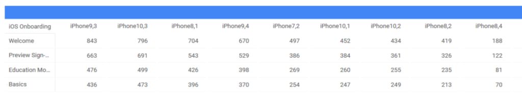
A quick tangent – I love this perspective in terms of how it can help define top-level strategy, filtering through to items such as device servicing for customer SLAs. Stitching together strategy with operations, internally and externally, is a stable coherent starting point for future conversations, internally and externally.
In the example above we’re looking at 4 events across 3 screens. Even this low definition provides a decent starting point to start tweaking product strategy. What if we track 60 extra events into the same user journey? Would this enrich the data? Would it provide new insight?
Most probably in the example above. A good abstract way to look at event tracking is consider frames per second (typically I’m thinking animated GIFs here). To few frames per second and the picture may not be fully formed (spot the 2nd football in the image below!).

Conversely, 120 FPS and 90 FPS below, there’s minimal discernible difference in the end output.
Convert Qualitative User Feedback (Captured as Events) into Quantitative Operational Data
All of the metrics displayed so far have been hard numbers e.g. recording the fact, even softer behaviours have been recorded as events. They still require some calculation or interpretation (unless already automated).
An intriguing element of building out products is weaving in user feedback. Historically, for many companies this has happened outside of the product, isolated from the experience. Tools such as Intercom, Drift, Localytics enable in-product feedback to be collected in the moment, in sequence with the experience, for all types of deep analysis, personalisation, experimentation etc.
- Event
- Event
- Thumb Up / down / neutral (or smileys or NPS etc)
- Event
The feedback request could be moved in the journey, or repeated per event, or run as product experiments to improve the experience (based on key metrics optimised).
A basic example is asking the question: “What do you think of X feature?” Input box. To automate and scale this (if proved useful through prototyping), would be to create spin-off columns such as ‘Categorisation: complement; bug; request; other’ etc. That data can then be aggregated (e.g. 50% users encountered a bug) and used to quantify reasons behind drop-off. Bugs are most commonly spotted by tools designed for that task, so perhaps a better example is 75% users request an update to a feature (or provide feedback that they needed more info / didn’t understand). Clear pivotable data points have been created to provide that feedback and trend it going forwards.
This also generates data for more advanced segmentation and hypotheses. For example, are users who provide feedback (or a specific type of feedback) more likely to do X? Also, are they more likely than people who feedback Y to X? X could be share on social media or refer a friend as examples. Data collected primarily to inform product experience is now directed towards building behaviours that create new data points and growth potential.
Takeaways:
- Everything is measurable.
- Not everything is easy to measure.
- Events can be captured from nearly all tools (critical BI could be missed if too much focus is on one platform in an multi-tool setup)
- Data that looks valuable may be junk. Data that looks like junk may be valuable.
- Custom metrics can be created (evolved, destroyed quickly).
- How loosely or highly defined a product is can be quantified using event tracking.
- Event tracking is part of a bigger system, it’s end purpose and value may not be apparent at the start of the journey but it should provide plenty of insight and eureka moments.